4.3.4 Charts - LUPMISManual
Main menu:
- 0. Introduction
- 1. GIS handling
-
2. GIS data entry
- 2.1 Create new layer
- 2.2 Digitize line
- 2.3 Digitize point
- 2.4 Digitize polygon
- 2.5 Edit existing layer
- 2.6 Delete feature
- 2.7 Split line
- 2.8 Split polygon
- 2.9 Merge lines from different layers
- 2.10 Unite lines
- 2.11 Snap lines
- 2.12 Join polygons
- 2.13 Extend polygon
- 2.14 Insert island
- 2.15 Define unit surrounding islands
- 2.16 Create 'doughnut'
- 2.17 Fill 'doughnut' polygon
- 2.18 Fill polygon with 'holes'
- 2.19 Digitize parcels from sector layout
-
3. GIS operations
- 3.1 Create buffer
- 3.2 Create exclusion zone
- 3.3 Overlay units
- 3.4 Convert line to polygon
- 3.5 Derive statistics (area size, length)
- 3.6 Clip unit according to other unit
- 3.7 Create geographic grid
- 3.8 Move entire vector map
- 3.9 Move or copy individual features on a map
- 3.10 Adjust polygon to line
- 3.11 Convert points to polygon
- 3.12 Define by distance
- 3.13 Create multiple objects
- 3.14 Transfer styles from one layer to another
-
4. Attribute database
- 4.1 Start with database
- 4.2 Import database
- 4.3 Display database information
- 4.4 Enter attribute data
- 4.5 Attribute matrix of multiple layers
- 4.6 Seeds
- 4.7 Repair attribute data
- 4.8 Merge lines with attached database
- 4.9 Transfer attribute data from points to polygons
- 4.10 Copy styles, labels, attributes
-
5. Conversion of data
-
5.1 Points
- 5.1.1 Import list of points from text file
- 5.1.2 Import list of points from Excel file
- 5.1.3 Convert point coordinates between projections
- 5.1.4 Convert point coordinates from Ghana War Office (feet)
- 5.1.5 Convert point coordinates from Ghana Clark 1880 (feet)
- 5.1.6 Track with GPS
- 5.1.7 Download GPS track from Garmin
- 5.1.8 Download GPS track from PDA
- 5.1.9 Frequency analysis of points
- 5.2 Vector maps
- 5.3 Raster maps
-
5.4 Communication with other GIS programs
- 5.4.1 Import GIS data from SHP format
- 5.4.2 Import GIS data from E00 format
- 5.4.3 Import GIS data from AutoCAD
- 5.4.4 Export LUPMIS data to other programs
- 5.4.5 Export GIS to AutoCAD
- 5.4.6 Change a shape file to GPX
- 5.4.7 Transfer GIS data to other LUPMIS installations
- 5.4.8 Digitize lines in Google Earth
- 5.5 Terrain data
- 5.6 Export to tables
- 5.7 Density map
-
5.1 Points
-
6. Presentation
- 6.1 Labels
- 6.2 Styles and Symbols
- 6.3 Marginalia
- 6.4 Legend
- 6.5 Map template
- 6.6 Final print
- 6.7 Print to file
- 6.8 3D visualization
- 6.9 External display of features
- 6.10 Google
-
7. GIS for land use planning
- 7.1 Introduction to land use planning
- 7.2 Land use mapping for Structure Plan
- 7.3 Detail mapping for Local Plan
- 7.4 Framework
- 7.5 Structure Plan
- 7.6 Local Plan
- 7.7 Follow-up plans from Local Plan
- 7.8 Land evaluation
-
8. LUPMIS Tools
- 8.1 General
-
8.2 Drawing Tools
- 8.2.1 Overview
- 8.2.2 UPN
- 8.2.3 Streetname + housenumbers
- 8.2.4 Lines
- 8.2.5 Arcs
- 8.2.6 Polygons
- 8.2.7 Points
- 8.2.8 Cut line
- 8.2.9 Other Drawing Tools
- 8.2.10 Import
- 8.2.11 Projections + conversions
- 8.2.12 Format conversion
- 8.2.13 Other GIS Tools
- 8.2.14 Utilities
- 8.3 Printing Tools
- 8.4 Permit Tools
- 8.5 Census Tools
-
8.6 Revenue Tools
- 8.6.1 Overview
- 8.6.2 Entry of revenue data
- 8.6.3 Retrieval of revenue data
- 8.6.4 Revenue maps
- 8.6.5 Other revenue tools
- 8.7 Reports Tools
- 8.8 Project Tools
- 8.9 Settings
-
9. Databases
- 9.1 Permit Database
-
9.2 Plans
- 9.2.1 Accra
- 9.2.2 Kasoa
- 9.2.3 Dodowa
- 9.2.4 Sekondi-Takoradi
-
9.3 Census Database
-
9.4 Revenue Database
-
9.5 Report Database
-
9.6 Project Database
- 9.7 Address Database
-
Annexes 1-10
- A1. LUPMIS setup
- A2. Background to cartography/raster images
- A3. Glosssary
- A4. Troubleshooting
- A5. Styles
- A6. Classification for landuse mapping/planning
- A7. GIS utilities
- A8. Map projection parameters
- A9. Regions / Districts
- A 10. Standards
-
Annexes 11-20
- A11. LUPMIS distribution
- A12. Garmin GPS
- A13. Training
- A14. ArcView
- A15. Population statistics
- A16. Entry and display of survey data
- A17. External exercises
- A18. Programming
- A19. Paper sizes
- A20. Various IT advices
- A21. Site map and references
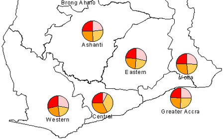
4.3.4 Display of charts
You can display charts on the map representing figures of the database.
You start in the same way as explained above, i.e. including the database with numeric values for the percentage distribution of each pie chart. (If the database is not loaded, you have to load it: 'Choose database', see steps 1-3 of Chapter 4.2).
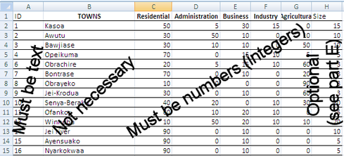
In Map Maker: Check that the values for the display in the loaded database are numbers by Project manager > Data link > Database: The left column must show 'integer'. If not, change the table (for example, in MS Excel). Also, check that the ID in the DRA file and in the source table match each other.
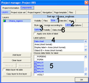
Then:
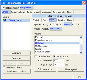
From the Project manager window: Style (1, see below) > Labels (2) > Option (3) > Data chart (4) > Select the data field (or fields) you want to display (5, here: MAL01, MAL02, MAL03, MAL04) > Data chart (6) >
> Select chart type (here: Histogram) > If required: Adjust 100% range and size of chart > OK
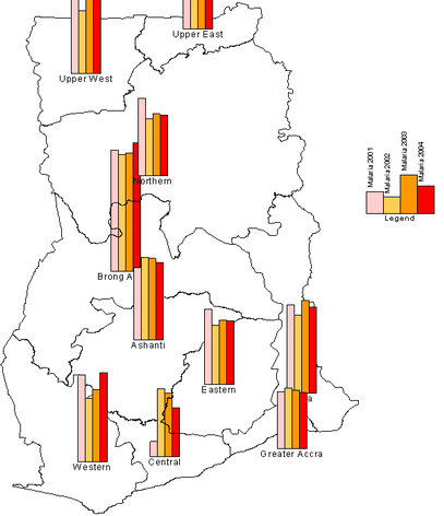
The histogram chart should look like this:
A pie diagram chart can look like this:
To create a small additional legend, as shown on the histogram chart above:
After you have selected the type of diagram (in example above: Histogram) and possibly edited the chart colours: Make legend > Make legend window: Size and title > Change size, font, colour if required > Labels > Enter short, but descriptive labels > Preview > Save to EMF file > Enter file name for EMF file > Save, and proceed as described above.
You call this EMF file through ‘map furniture’: Right-mouse > Map Furniture > Locate box on map, where the legend should be placed > Map furniture window: Furniture type: Enhance Metafile > Select EMF file, just created > Open > OK
(See also Chapter 6.3.1 for more descriptions on ‘map furniture’).